Blog
Top 5 Graphic Design Trends
What is inspiring in the web design sphere is that there are always new things that are interconnected with the well-forgotten old, offering designers and clients the biggest breath of fresh air. Just look how the World is about to reset after being trapped in 2020. The trajectory of today's design styles is to mix the topics of sci-fi and futuristic tech from previous decades with the 2021 trends that put people and their influence first. Pretty intriguing combination, isn't it?
All in all, graphic design is experiencing huge transformations into something very unique. So let's take a look at the path, which modern design trends have decided to follow.

Although flat design trends are still the heart of the whole graphic design of this century, they are slowly giving a way for 3D illustrations. Since 2019, when they were first implemented, designers start to give these pics more attention, because these illustrations can showcase new dimensions and environments. Thanks to technological improvement, there are no obstacles in creating 3d designs and use them wherever you want. Added to this is that we are entering into an era-defining world with AR and VR. Being able to show all the 3d textures in virtual reality has already become a necessity, as more and more people try to escape today's world and its never-ending problems. The 3D design is a real game-changer nowadays.

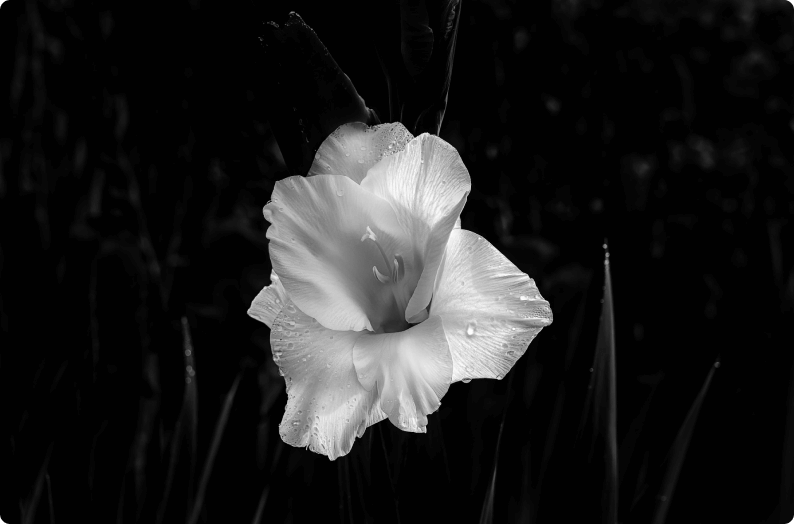
Past design practices in minimalism generated black and white styles that never were colorful. Fortunately, modern designers changed everything and redefined minimalistic designs. Colorful minimalism, which means using brighter colors and simple gradients at once, produces very eye-catching visuals. To create an interesting minimalistic style, besides implementing brighter colors and simple gradients, the use of futuristic elements and bold fonts will come in handy. Such design treads the fine lines between complexity and dullness. Brands like Nike and Apple often resort to colorful minimalism in their designs.
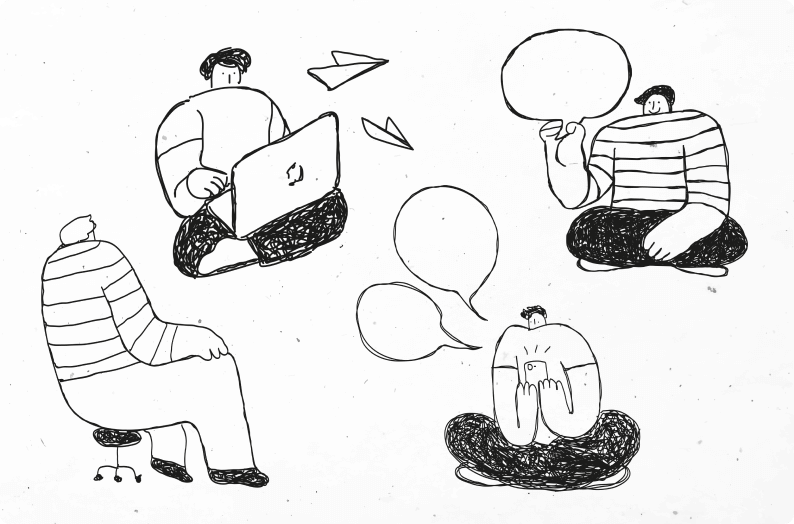
Commonly, some brands use generic illustrations to represent themselves. But such a strategy will only work against your branding and popularity. Thanks to modern technologies, there are various ways for your brand to stand out. Hand-drawn illustrations are one example that can help to generate unique visuals to attract more customers. One of the best things about such pics is that they are complicated and simple at the same time, and they will never be replicated. It will be only your masterpiece. This unusual method is definitely here to stay. Predictions say that the use of simple sketches or detailed drawings as a graphic design tool will only grow with time. So be ready for that!
Psychedelic design is an art form that tends to have intense colours, free-flowing lines, and kaleidoscopic patterns. It was created in San Francisco in the 1960s by artists who belonged to the hippie movement, first appearing as posters for rock concerts being played around the city. It was at its most popular during the 60s and 70s. It isn’t necessary to go the whole hog either—graphic designers can take particular elements of psychedelic design and weave them into their work for businesses, creating a freshness that makes people sit up and pay attention, especially if it’s unexpected.
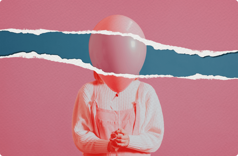
Stable and similar design layouts are losing their importance by leaps and bounds. They make the eyes of the viewer fatigue because of this monotone style. People are eager to have refreshed, and asymmetrical design can fulfill their desire. The need for products that feel alive and bespoke has turned odds in favor of asymmetrical design patterns. The reason behind this tendency is that asymmetry lends products more kinetic movement and authenticity. Not symmetrical style provokes interest and reactions in viewers, so that they stay longer on your website page and spark their curiosity this way. By this, asymmetry is the best on platforms/websites where high user engagement is required.
To wrap it up. The dynamics of graphic design are constantly changing. The tendencies in this sphere have to be adaptable to satisfy even instant needs of clients and viewers. The trends that we highlighted here may stay to be relevant for a longer period of time, while others may go into obscurity the next day. No one ever knows in which ways graphic design will be redefined again. It is a topic of adaptability and constant urge to learn to be always all the rage in design.
